Tips for Photography Business Cards
Just like a picture is worth a thousand words, your photography business cards say a lot more than who you are and what you do.
It’s a reflection of your image, how people perceive you and your company and is a perfect opportunity to showcase your skills and what you can offer potential customers. Whether you’re a freelance photographer just starting out, or an established photographer working for an agency, there are a few important things to consider about your business cards.
Pocket It
Make a habit of keeping your photography business cards on you at all times! In a face-to-face interaction, a business card establishes you as a genuine photographer and sets the tone for how you’ll interact with a client. In the digital age, it can be easy to think you’ll just store other peoples information on your phone, but not only does that feel impersonal, it distracts you from that potential client.
As well as a conversation starter, business cards are also a cost-effective marketing tool. Many venues allow photographers to leave their business cards for other visitors who stop by, making your services available to your target audience at virtually no cost to you.
Content is Key
Consider what content to put on your photography business cards - your name, job title, telephone number and email address are the most obvious ones, but what about a link to your website or portfolio too? It’s important that these basics are in place so that potential clients know who you are, what you do, how they can contact you and where they can find more information. Once that bit’s sorted, you can get to the fun part - adding some branding and personality!
TOP TIP: Always remember to proof check your cards for common errors - you don’t want to hand out hundreds of business cards to find you’ve put the wrong phone number down!
Mirror Image
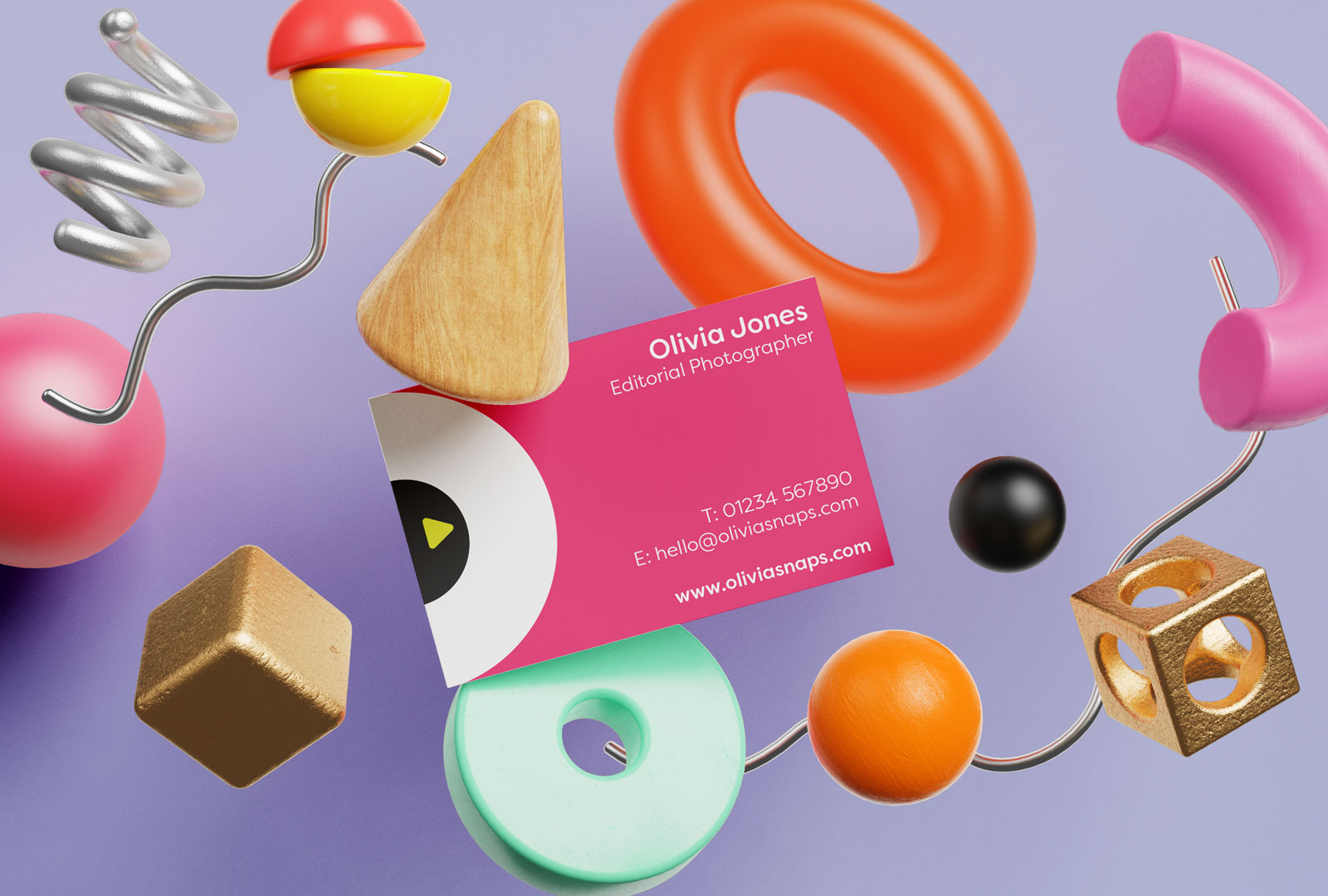
How your business card looks is a reflection of you and what you do - it establishes your brand and attracts new clients. Do you specialise in portrait photography? Consider using a close-up photo you’ve taken. If you work for an agency, you could consider something more abstract or editorial. Whatever your focus is, it’s important to showcase your skills!
Another thing to take into account is colour. Colour can strongly affect perceptions and behaviours and impact your clients’ impression of your brand. Although there is no right or wrong colour to use on your photography business cards, make sure it’s appropriate for your brand and shows off your personality. A monochrome design creates a highly sophisticated image - perfect if you’re a fashion or architectural photographer, but not so much if you specialise in sports photography where a more vibrant and energetic scheme might be more suitable.

Can you feel it?
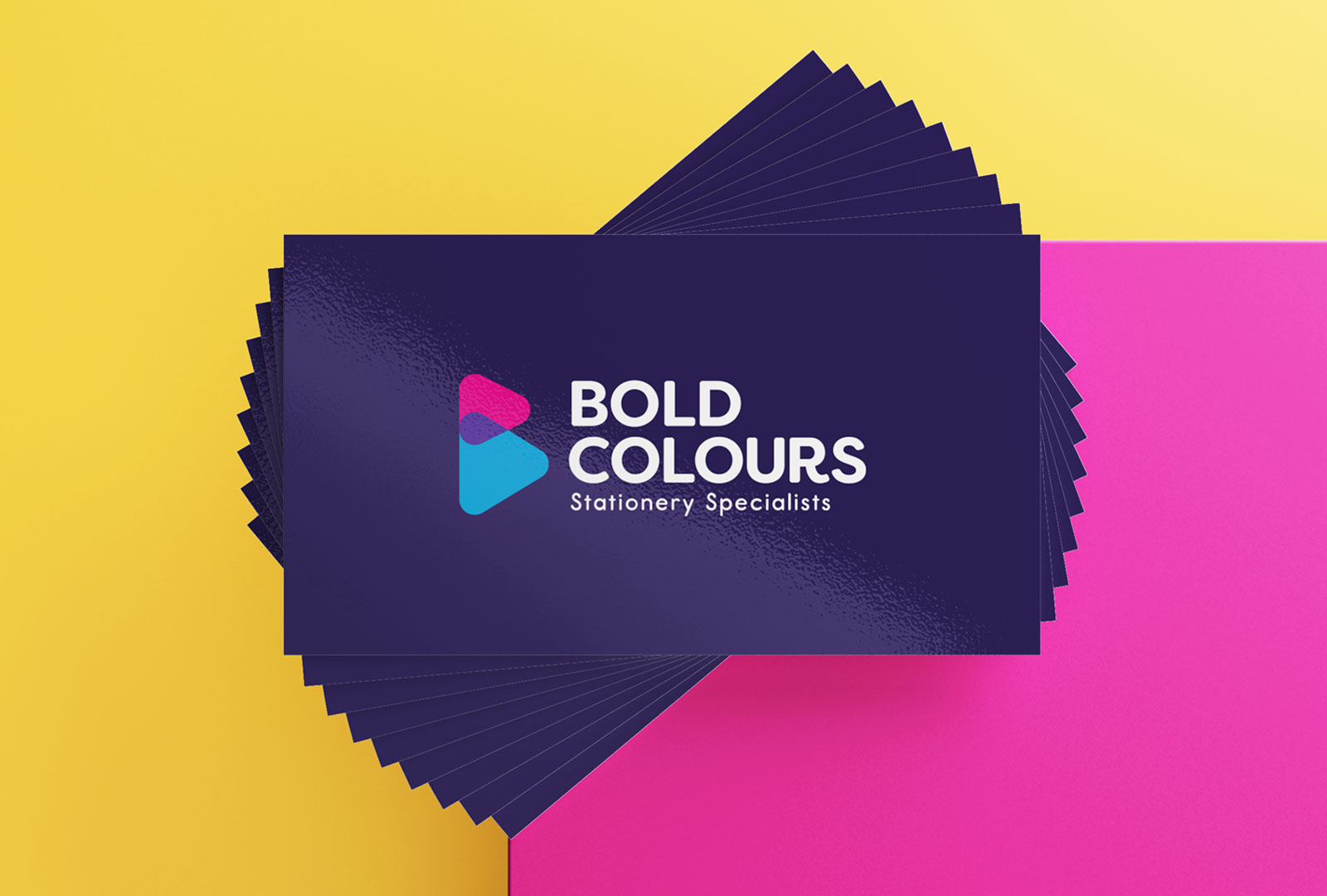
Most people tend to be tactile so choose a material wisely! Think about how potential clients would feel holding your card. A heavier weight card with a soft-touch finish can feel very premium, whereas a recycled material with a matt finish could show you’re eco-conscious and practical. A glossy finish reflects light, stands out from the crowd and also enhances colours - this is particularly effective if you have a photo on your business card.
No matter what design or finish you choose for your photographer business cards, you can be sure they’ll make an impact and create long-lasting client relationships.